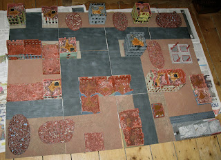
Invariably providing both armies and the scenery, I tend to think in terms of 'games' rather than armies, and 'Crossfiregrad' is the new title I've given my Crossfire mini-Stalingrad game. As previously mentioned, I've been wanting for a long time now to improve the look of this game by adding pavements and rubble-strewn streets, but was torn between (1) adding pavements to the buildings, (2) adding separate pavements or (3) modelling pavements and roads as part of a modular tile system.
Adding pavements to the buildings would have interfered with the way I can currently store six 4" x 4" building modules in an A4 Really Useful Box, while separate pavements would have been fiddly. Modular tiles seemed the best option but it took a long time to work out a street plan. The challenges were to:
- Capture a 'Stalingrad look'. Pre-war photos show that Stalingrad had an open, 'garden city' look with wide perpendicular streets. Blocks typically had buildings around their perimeters leaving a hollow centre.
- Comply with Crossfire's requirements for defined areas and restricted lanes of fire. The roads running parallel to the axis of play (i.e. between the long sides) have to be offset to reduce ranges.
- Work with my existing 4" x 4" modular buildings.
- Be as modular as possible so the layout can be varied.
Actually achieving this
within the confines of the 12" tiles was not straightforward. I made many
attempts to create a design in CorelDraw, but in the end I found the best way
to plan the modules was to lay out the tiles, arrange the actual buildings and use
pieces of paper to represent the roads. (The scribblings on the tiles are the result of earlier attempts).
Having created the design
'on the ground', I then replicated it in CorelDraw for reference.
The layout plan isn't absolutely modular but it has elements of modularity. The photograph shows the first stage which consisted of marking out the roads and central square and adding the pavements.
My terrain tiles of
choice are 12" (300mm) cork floor tiles because they are thin and light.
Once coated with PVA and sand (on the glossy side) they become quite strong and
have never, in my experience, warped. Here they are being 'sanded' inside a box. (Sand is not good for varnished wooden floorboards!)
Some of the tiles were my
existing urban tiles already painted black and dry-brushed with grey, so I
could leave that finish as the roads and fill in the rest.
A tile after a coat of emulsion on the rough areas. I will probably have to go over them again.
Some of the tiles drying off.
All the tiles arranged in the planned layout. The cityscape has three zones: commercial focused on the top-left, residential in the bottom centre and industrial to the bottom right.
All the tiles, the buildings and the rubble piles. Crossfire needs defined area, in this case buildings and rubble piles, so I can't just have continuous gradations of rubble as you would in a diorama. I have to have definable hard edges. Rubble immediately around the buildings will be added later. This is a work in progress.


No comments:
Post a Comment